Wednesday, May 21, 2014

Product Design

"Product Design"


We most often take what we have for granted.  The things we use in our day to day lives all had to have come from somewhere, right?  The process and dedication of those who make something completely new benefits everyone.  We also see how different people's minds work and operate.  All in all, the designs come out to be phenomenal.

What makes a good logo?

"What makes a good logo?"


Lets start off with the fact that logo design can be a nightmare.  Clients have a vision of an idea that is completely different with what you were thinking about.  Or better yet, they don't decide on an idea that just simply works for their company.  By following the 5 basic guides mentioned in the above picture, it can truly help.  Take time and question yourself, "Does my design have the following principles of being simple, memorable, timeless, versatile, and appropriate?"  If you do, then you will see that your design should become more centered around what the client wants and envisions.  

Kekai Kotaki

"Kekai Kotaki"


Kekai Kotaki is a very skilled concept artist who has done art for various companies such as Arenanet, Bungie, and so on.  I watched a few Q & A discussions he had with a Youtuber and the sheer talent that he possess is phenomenal.  The above digital paintings are from his personal work and depict two knights.  Kekai is a very talented artist that everyone should take the time to do some research on.

Vector Illustrations

"Vector Illustrations"


Vector illustrations and graphics come in all sizes, shapes, and forms. There are people who create simplistic designs, and then there are others who create hyper-realistic designs.  It is all based on personal preference and where you really find your niche.  Above I posted 2 portrait designs where the artists involved take different approaches to it.  The design in the middle is a simple, yet intricate design.

Logo Design

"Logo Design"


Logos are something that defines a company, it gives them an image.  Above are just a handful of popular logos that definitely defined the companies listed.  These logos fit the company well and almost in a way, tell you what the company is based around.  Whether it be a classic looking design, to something that is new and more modern, it gives every company a personal look.

Fantasy Design


"Digital Painting"


Digital painting has been one of the most sought-after concepts that I would like to learn.  It requires finesse and dedication in order to get good results.  Above are just two examples of what I would like to be able to accomplish one day.  

Thursday, May 15, 2014

Movie Posters

Movie Posters


"Super 8"

"The Slender Man"

"Batman: The Dark Knight Rises"


All of these movie posters share similar tonal attributes in one way or another.  They make use of darker and more shaded grays and blacks with whites as highlights.  This conveys a darker atmosphere and usually foreshadows some form of impending doom.  The text is easily readable, but that is not what the posters are centered around.  They are more visually appealing, than the text is.  Of all of the posters, my most favorite would have to be the Batman one.  The use of a multi-leveled background and visual images is remarkable.  However I do like the Slender Man poster because it focuses the viewer's attention towards the middle, looking on at a shady figure that is in what appears to be a mist.  All in all these posters have done a good job in captivating the viewer and conveying the atmosphere of the movie.

Wednesday, April 23, 2014

Surreal Portrait Tutorial

Found an interesting website that teaches you to create surreal portraits using multiple photos. Rob Shields (writer of the page) makes use of a slide show to teach.  It says it takes 10 hours, but I don't think that it seems like that much work.

http://www.digitalartsonline.co.uk/tutorials/photoshop/paint-multilayered-surreal-portrait/

Tuesday, April 8, 2014

Maggie Taylor


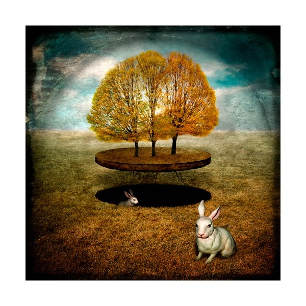
Maggie Taylor is truly a talented digital artist.  The first thing that drew me to this photo was the completely normal idea, that was then incorporated with something completely abstract (floating trees).  This picture really paints the scene of this setting in an area that seems to look like a prairie.  It also insinuates the rabbit hole / home in which they live.  It's hiding right "under the noses" of the trees.  Cropping, masking, brushing, editing, were all techniques used to create this wonderful piece of art.  It truly takes each and every technique in order to obtain something of this stature.  The one aspect of this picture that really attracts me is the floating trees centered in the middle.  They become the main figures in the mid-ground, focusing the viewers attention to there.  There is a bit of Classical movement in her designs and they definitely center around a form of realism.  All in all, Maggie Taylor is a very talented digital artist.

Wednesday, March 19, 2014

Photo-montage Artist


Thomas Barbey


I did a bit of digging around and found a photo-montage artist whom I like.  Most of his work in gray-scale and conveys some underlying meaning behind it.  His name is Thomas Barbey.


The photo I posted above shows an artist who likes to provide the "big picture."  I have noticed that Thomas Barbey has used this style to create most of his work.  Whether or not its small sayings like "The sky is the limit" or "The person behind the mask," all of his work shows signs of that.  I've chosen to upload this photo because it truly has an interesting meaning behind it.  Personally, I get the feeling that Barbey is trying to present us with "The sky is the limit."  The only deterrence in life is ourselves, because if we put our mind to it, we can accomplish nearly anything.  Words of wisdom and strength like this are beneficial to all the viewers.

Wednesday, March 12, 2014

Graphic Design Pricing

Many Graphic Designers can often do the work.  They can talk to their clients and often come to conclusions on what the client wants.  However I, and many others, have trouble pricing their designs at a reason cost for both ourself and the client (obviously).  I stumbled along a post by a designer named David Airey, who lists his way of calculating the costs for the client.  He does this in a way that not only makes sense mentally, but visually as well. I apologize in advance for the poor image quality, the photo was configurable.


Wednesday, March 5, 2014

Image Storing

"Do you use a site for storing or viewing photographs? What site(s) do you use?"

I tend to store all of my artwork on websites such as Imgur or Flickr, but I try avoiding have to.  Imgur is a very useful site if you are going to be your image on a blog, email, or so on.  It has all the basic necessities needed, but not to mention its also free.  As for photo viewing, I use the same websites, but I also use Instagram.

www.imgur.com
www.instagram.com

Wednesday, February 26, 2014

Digital Painting Tutorials

Concept art has always been a big inspiration for me as an artist.  Getting to the level of all of the artists out there in the world is very difficult and hope to achieve this one day.  A website that has provided substantial help in starting off digital painting is a website called Ctrl + Paint.  Matt Kohr provides free video-based tutorials in which he teaches you the basics and then progresses further.  He also provides files that are used in the videos so that you can follow along more easily.  For anyone interested in digital painting, I suggest glancing at the videos on his website and see if they are interesting to you.  www.ctrlpaint.com


Intro Video to Digital Painting


Wednesday, February 19, 2014

Pedro Meyer


Pedro Meyer was a particularly interesting photographer.  His photos tend to center around some underlying theme that he tries to surface via the use of photos he has taken.  Some of his more popular photography came in the form of photo collages.  In the picture posted above,we clearly see that this is a preacher of some sort, trying to grab the attention of the transient walkers.  However, this is something that we clearly see.  What is the message that Meyer is putting underneath that thick overcoat?  Before we get into detail, I just want to simply state that this is an observation that I have made regarding what the image depicts.  Religion tends to be centered around the Bible as the inspired Word of God.  So this preacher is most likely hinting towards the idea that, if, you do not pay heed to the Bible, then as Christianity teaches most often, you will be sent to hell instead of heaven when you die.  By use of the smokey cloud that is overlaying the photo, Meyer brings a sort of grim and hellish future for those who do not listen.  The source images for this photo put the picture into perspective.  Sadly I cannot find the original photo for this, but in the case for the preacher, it was a photo that was merely him as the center of the image.  However the second photo, was of this picture, minus the preacher that is in the foreground.  The smokey mist you see is simply the subway venting out into the street.  Overall Meyer did an excellent job in portraying the message he wanted everyone to receive.  He did so by use of layers (most obvious) but then through carefully masking and blending those layers together.  If there were no sources to this photo, then the viewer would have no clue that this is two separate photos.

Wednesday, February 12, 2014

Adam Adamowicz


Adam Adamowicz is a famous concept artist who worked for the popular company Bethesda Softworks.  He was a very talented artist who could clearly capture his imagination on screen and bring any work to life.  When you look at a piece of his artwork, you can immediately tell his distinct style.  Regardless of not knowing the setting that it takes place in, every picture of his tells a story, a theme, conveying some central idea.  Adam's work is both visually and technically pleasing.  The amount of detail that has been put into his images is astounding.  Every line, brush, and stroke has been well thought out and placed to serve a purpose.  His pieces are also technically pleasing because it has all been done properly.  There were no shortcuts taken.  All of his color and line art match up to what it should be.  Sadly, Adam Adamowicz passed away on February 9th, 2012, due to lung cancer.  His work will always be remembered.

Wednesday, February 5, 2014

Hoax Image

This photo was published by Photographer Brian Walski, from the Los Angeles Times Newspaper Company.
The original image was far less intense than what it truly seemed.

Below is the original photo with the gun-wielding soldier yelling out to someone in the crowd.
Original Photo 1
Original Photo 2
The "hoax" image was clearly altered to have the man holding his baby while facing the yelling soldier.  It was believed to be authentic simply because it looks like a real photo and there would be no knowing if it was a hoax or not.